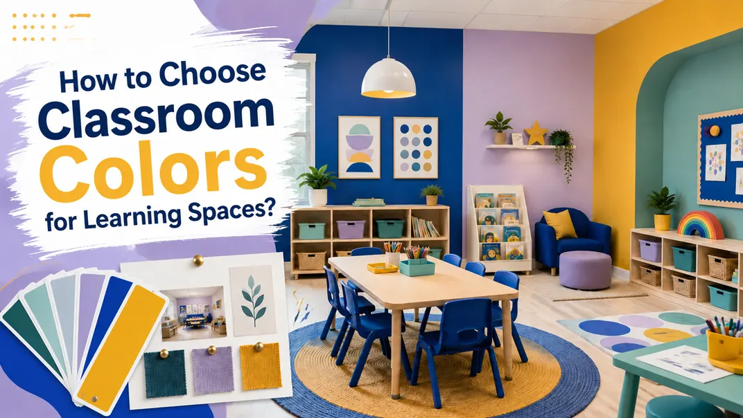
Classroom colors play a bigger role than many people realize. When someone walks into a classroom, the color palette immediately affects how the space feels. A room can feel calm, bright, organized, warm, playful, or overwhelming before anyone looks closely at the furniture or teaching materials.
Research from the University of Salford’s HEAD Project found that classroom design factors such as light, air quality, temperature, flexibility, and color can together explain 16% of the variation in pupils’ learning progress over a year. The study assessed 153 classrooms, 27 schools, and 3,766 pupils, showing that the physical classroom environment can have a measurable impact on learning outcomes.
Color also affects how visually “busy” a classroom feels. A Carnegie Mellon study on kindergarten children found that highly decorated classroom walls made children more distracted, more off-task, and showed smaller learning gains compared with a less decorated classroom environment.
This does not mean classrooms should be plain or colorless. It means classroom colors need to be planned with purpose. A good classroom color scheme should create a calm background, support different learning areas, reduce unnecessary visual distraction, and still make the room feel warm and engaging.
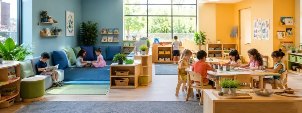
Why Classroom Colors Matter in Early Learning Spaces?
Classroom colors affect how a room feels and how easily children understand the space. A good color plan can make the classroom calmer, cleaner, and easier to manage.
For early learning spaces, the goal is not to make the room as colorful as possible. The better approach is to use color with purpose.
Create a Better First Impression
Color is one of the first things people notice when they enter a classroom. A balanced color scheme makes the room look more organized, professional, and welcoming.
Reduce Visual Clutter
Classrooms already have many colorful materials, such as toys, books, rugs, and displays. Softer wall and furniture colors help the room feel less busy.
Support Different Activity Areas
Color can help separate areas like reading, art, building, and dramatic play. This makes the classroom easier for children to recognize and easier for teachers to guide.
Classroom colors should help the space feel clear and easy to use. Large surfaces and main furniture pieces are better kept calm, while brighter colors can be used as small accents.
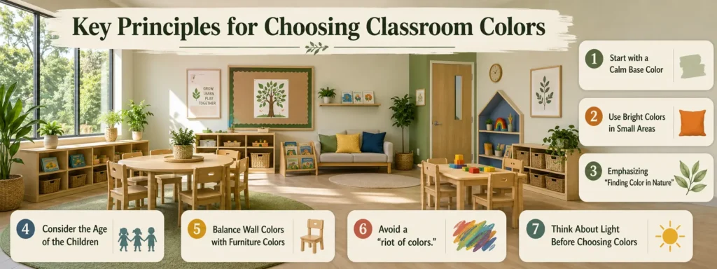
Key Principles for Choosing Classroom Colors
Choosing classroom colors is easier when you start with a few practical principles. Instead of asking “What color is best?”, it is better to ask “How will this color work in the whole classroom?”
1. Start with a Calm Base Color
The base color serves as the primary background hue of the classroom. It typically covers large surfaces such as walls, cabinets, flooring, and major furniture pieces. Since preschool items—like books and toys—are already colorful, a soft base color creates a clean, comfortable backdrop without making the classroom feel overly cluttered.
2. Use Bright Colors in Small Areas
Use small, purposeful pops of accent color against a neutral background to enliven the space. These colors should not be applied over large areas but rather incorporated through specific furniture details, soft furnishings, or playful wall treatments. Furthermore, decorations and themes can be changed without the need to redesign the entire classroom.
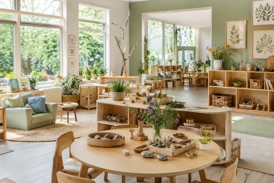
3. Emphasizing “Finding Color in Nature”
Nature is the ultimate colorist. Draw inspiration from the natural world—the warmth of wood, the lush green of foliage, the azure of the sky, the beige of sand, and the gray of stone. These hues not only create a serene, tranquil atmosphere but also harmonize effortlessly with various materials such as wood, wicker, and linen.
4. Consider the Age of the Children
Children of different ages respond to color in different ways; therefore, color choices should align with their developmental stages.
Younger children generally prefer soft colors, lower contrast, and a calmer environment, whereas older children are typically able to handle bolder color blocking, stronger visual cues, and more complex classroom layouts.
5. Balance Wall Colors with Furniture Colors
Furniture occupies a significant portion of a classroom’s visual space. The choice of furniture influences the final color scheme. If the walls are already brightly colored, the furniture should generally be kept simple. Conversely, if the wall colors are neutral, furniture or soft furnishings can introduce accents of soft color.
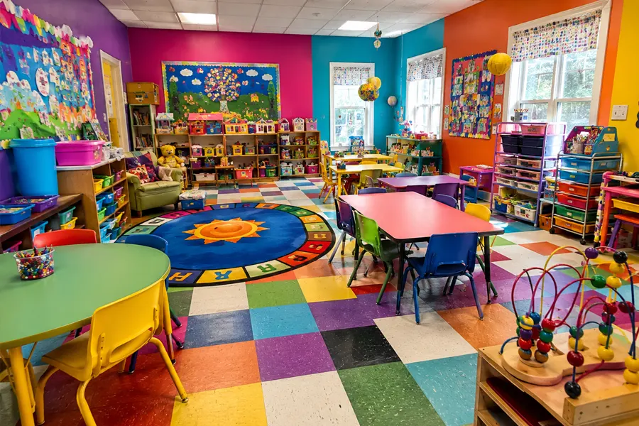
6. Avoid a “riot of colors.”
A common misconception is that classrooms for children should be a riot of color. In reality, an excess of bright colors can distract children, making them restless and hindering their ability to focus—a phenomenon known as “sensory overstimulation.”
Core Principle: 80% of the space (walls and major furniture) should feature neutral tones, while 20% is reserved for accent colors (decor, soft furnishings, and select furniture pieces) to add vibrancy.
This streamlined structure helps create a more organized classroom atmosphere while giving the space a stronger, more distinctive visual identity.
7. Think About Light Before Choosing Colors
Lighting in the classroom affects how colors appear. Before finalizing the classroom color scheme, consider the amount of natural light the room receives and the type of lighting used.
Testing colors in the actual room is always beneficial, especially for large-scale projects or complete classroom renovations.
Best Classroom Colors for Daycare Spaces
An ideal classroom color scheme should balance calmness, warmth, and visual interest. A good color scheme does not require a multitude of colors; it simply calls for using the right colors in the right places.
Soft Neutrals: The Clean Base Color

Soft neutrals such as warm white, beige, cream, and light gray create a clean and flexible foundation for classroom design. They make the room feel open and organized while leaving enough visual space for books, toys, artwork, and learning materials.
- Best for: Walls, large cabinets, shelving, display areas, general classroom background
- Design impact: Makes the classroom look cleaner, brighter, and easier to organize visually
- Practical tip: Use soft neutrals as the main color, then add wood tones or soft accent colors to avoid a cold or empty feeling
Natural Wood Tones: The Warm Balance Color

Natural wood tones are among the most practical choices for classroom furniture. They bring a sense of warmth to the room and help alleviate the visual strain caused by bright colors.
- Best for: Tables, chairs, shelves, book displays, storage units, activity furniture
- Design impact: Creates a warm, natural, and long-lasting classroom style
- Practical tip: Wood-tone furniture works well with white, beige, soft green, light blue, and earth-tone walls
Soft Green: The Calm Nature Color

Soft green gives the classroom a calm and natural feeling. It works well in areas where children need to slow down, focus, read, or relax. Compared with bright green, muted green feels softer and easier to match with classroom furniture.
- Best for: Reading corners, quiet zones, sensory areas, nature-themed spaces
- Design impact: Helps create a peaceful and fresh classroom atmosphere
- Practical tip: Pair soft green with natural wood furniture, neutral rugs, and plants for a more balanced look
Light Blue: The Focus Color

Light blue is a useful color for areas that need concentration and structure. It gives the room a calm, clear feeling and can support activities that require attention, problem-solving, or quiet participation.
- Best for: Reading areas, STEM corners, building areas, quiet study zones
- Design impact: Creates a calm and focused learning environment
- Practical tip: Use light blue with warm white or natural wood tones so the classroom does not feel too cold
Warm Yellow: The Friendly Accent Color

Warm yellow can make a classroom feel brighter and more welcoming. It adds energy without making the whole room too busy when used in the right amount. Yellow works best as a detail color instead of a full-room color.
- Best for: Entry areas, art corners, display boards, small furniture details, activity zones
- Design impact: Adds warmth, brightness, and a friendly feeling to the classroom
- Practical tip: Choose soft yellow or muted yellow instead of strong yellow for large areas
Earth Tones: The Cozy Comfort Color

Earth tones such as sand, clay, terracotta, soft brown, and muted peach can make the classroom feel warmer and more home-like. These colors are especially useful in spaces where comfort and emotional security are important.
- Best for: Dramatic play areas, cozy corners, infant rooms, soft seating areas
- Design impact: Creates a gentle, warm, and comfortable classroom atmosphere
- Practical tip: Combine earth tones with wooden furniture, woven baskets, and soft fabrics for a natural classroom style
Accent Colors: The Guidance Color

Bright colors can still be useful in classrooms, but they should have a clear purpose. Red, orange, bright blue, and bright green can help highlight activity zones, storage systems, or important visual cues.
- Best for: Storage labels, chairs, cushions, wall signs, activity markers, display details
- Design impact: Helps children recognize areas and adds playfulness to the classroom
- Practical tip: Keep accent colors small and consistent. Too many bright colors can make the room feel crowded
Simple Color Rule for Classrooms
A practical classroom color scheme can follow this structure:
| Color Role | Recommended Choice | Where to Use |
|---|---|---|
| Main color | Warm white, beige, light gray | Walls, large surfaces |
| Furniture color | Natural wood, white, soft neutral | Tables, chairs, shelves |
| Support color | Soft green, light blue, earth tone | Learning zones |
| Accent color | Yellow, orange, red, bright blue | Labels, cushions, small details |
Classroom Colors by Age Group
Children of different ages perceive, react to, and require colors in vastly different ways. A truly suitable classroom color scheme should fully take into account the children’s developmental stages, using color to support emotional regulation, concentration, and the desire to explore. Below are specific recommendations for selecting classroom colors for different age groups.
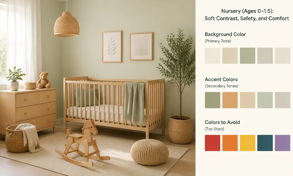
Nursery (Ages 0–1.5): Soft Contrast, Safety, and Comfort
Core Principle: Infants at this stage are developing their visual capabilities. While high-contrast colors can capture their attention, overly intense or chaotic colors can overstimulate their developing nervous systems.
Recommended Color Schemes:
- Background Color (Primary Tone): Opt for very pale, warm tones such as ivory, light beige, or soft cream. These colors create a warm, “cocoon-like” environment that fosters a sense of safety and relaxation for the infant.
- Accent Colors (Secondary Tones): Incorporate soft pale blue, pale pink, pale yellow, or mint green as accents. These colors can be introduced through tactile wall panels, hanging sensory toys, or colorful beads on a crib rail.
- Colors to Avoid: Pure black, pure white (high contrast is unsuitable for large surface areas), fluorescent colors, and highly saturated reds or blues.
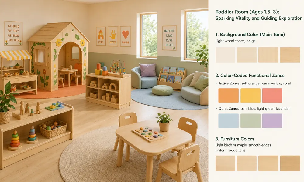
Toddler Room (Ages 1.5–3): Sparking Vitality and Guiding Exploration
Core Principle: Toddlers are in a stage of rapid development regarding language, social skills, and motor abilities. They need colors in their environment to stimulate curiosity and guide them in exploring different activity zones.
Recommended Color Schemes:
- Background Color (Main Tone): Retain light wood tones or beige as the base to maintain a serene atmosphere.
- Color-Coded Functional Zones: Use distinct accent colors to define the character of different functional areas, helping children develop spatial awareness.
- Active Zones (Construction, Role-play): Use warm tones such as soft orange, warm yellow, or coral. These colors stimulate energy and social interaction. A client once requested a “green and yellow indoor wooden playhouse painted with flowers” for the role-play area—a perfect example of using warm colors and natural elements to spark imagination.
- Quiet Zones (Reading, Sensory Play): Use cool tones such as pale blue, light green, or lavender. These colors help soothe emotions and encourage children to settle down and focus on sensory exploration.
- Furniture Colors: Clients generally prefer furniture in light birch or maple tones. One client specifically emphasized: “All furniture and storage units should have smooth edges… and a uniform maple finish.” A consistent wood tone effectively reduces visual clutter, allowing the accent colors of the functional zones to take center stage.
When discussing sofas for the early childhood classrooms with some Canadian clients, they proactively requested to swap the red sofas for green ones, as they felt “green is more natural” and wanted “all classrooms to adopt a natural style.”
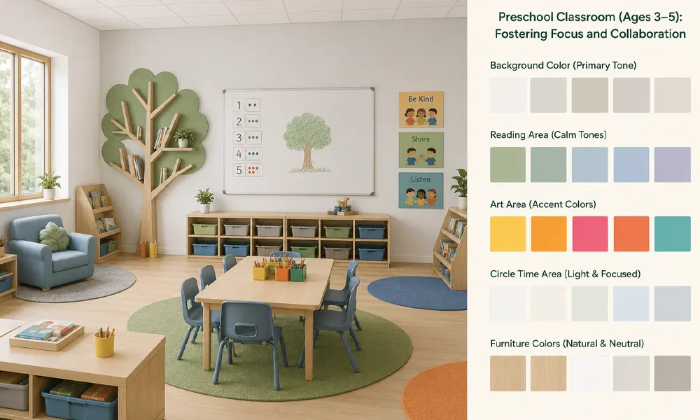
Preschool Classroom (Ages 3–5): Fostering Focus and Collaboration
Core Principles: Preschoolers begin engaging in more complex collaborative learning and early exploration of knowledge. Color choices should support focused learning and encourage communication while providing emotional support.
Recommended Color Schemes:
- Background Color (Primary Tone): Light gray or off-white for the walls. This provides a clean, professional “canvas” for the children’s learning activities.
- Reading Area: Use forest green, olive green, or grayish-blue to create a calm, contemplative atmosphere. These colors complement nature-inspired furniture, such as tree-shaped bookcases. Clients have previously selected light blue leather sofas and soft, patterned rugs for reading corners, favoring a soothing color palette.
- Art Area: Introduce bright yellow, orange, or fuchsia as accent colors—incorporated through art supply carts, easels, or colorful storage bins on shelving units—to spark creativity.
- Circle Time Area: Use a white or light-colored background to make it easier for teachers to display instructional materials (such as alphabet cards or number charts) and ensure a clear visual focus.
- Furniture Colors: Most classrooms favor natural wood, white, or soft neutral tones to complement the overall classroom color scheme.
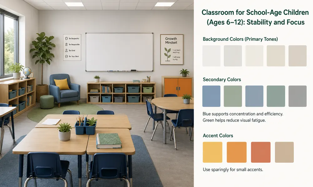
Classroom for School-Age Children (Ages 6–12): Stability and Focus
Core Principle: School-age children require sustained focus for academic learning. Colors should help minimize distractions and create a learning environment that is calm, steady, and positive.
Recommended Color Schemes:
- Background Colors (Primary Tones): Opt for light gray, off-white, or very pale beige. These colors do not distract and blend well with various teaching materials.
- Secondary Colors: Use blue, green, and gray as secondary colors. Blue enhances concentration and efficiency, making it suitable for math areas or information bulletin boards. Green helps alleviate visual fatigue, making it ideal for plant areas at the back of the classroom or reading corners used for extended periods.
- Accent Colors: Use warm colors sparingly and with restraint—such as a yellow cushion, an orange painting, or an orange storage cabinet door. These accents break up the monotony of the space without overpowering the overall design.
Classroom Color Ideas for Different Learning Areas
A classroom usually includes several activity zones. Each area has a different purpose, so the color choice should support the way children use that space.
| Learning Area | Better Color Direction | Why It Works |
|---|---|---|
| Reading Area | Soft green, beige, wood tone | Creates a quiet and relaxed feeling |
| Art Area | Neutral base + bright accents | Keeps the space creative without looking messy |
| Building Area | Light blue, gray, wood tone | Supports focus and structure |
| Dramatic Play Area | Warm tones, earth tones, wood tone | Creates a home-like atmosphere |
| Circle Time Area | Soft neutral colors | Reduces distraction during group activities |
| Storage Area | Neutral furniture + color labels | Makes materials easier to find |
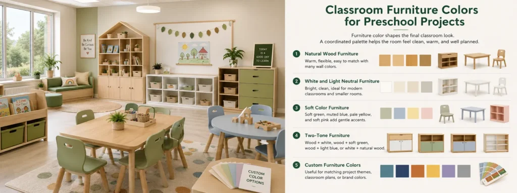
Classroom Furniture Colors for Preschool Projects
Furniture color significantly impacts the final look of a classroom, as desks and tables occupy the majority of the space. A mix-and-match approach to furniture colors can still make the classroom appear cluttered and cramped.
Natural Wood Furniture
Natural wood is one of the most flexible choices for classroom furniture. It brings warmth into the room and works well with many wall colors, including warm white, beige, soft green, light blue, and earth tones.
White and Light Neutral Furniture
White, cream, beige, and light gray furniture can make a classroom feel brighter and cleaner. These colors are suitable for modern classroom designs, small rooms, or spaces that need a lighter visual effect.
However, light-colored furniture is more prone to stains and everyday wear and tear.
Soft Color Furniture
Soft green, muted blue, pale yellow, and soft pink can be used when the classroom needs a gentle accent. These colors are better than strong primary colors for large furniture pieces because they feel softer and easier to match.
Two-Tone Furniture
Two-tone furniture is a good choice when the classroom needs visual interest but still wants a clean look. Common combinations include wood and white, wood and soft green, wood and light blue, or white and natural wood.
This style can make furniture look warmer and more designed without making the room too colorful.
Custom Furniture Colors
For classroom projects, custom furniture colors can help match the overall design plan, school brand, or room theme. This is useful when the project includes several classrooms, different age groups, or a fixed interior style.
Custom colors should still be practical. Strong brand colors can be used as accents, while the main furniture pieces should stay easy to match and suitable for long-term use.
FAQs About Classroom Colors
What are the best classroom colors?
The best classroom colors are usually soft neutrals, natural wood tones, soft green, light blue, warm yellow accents, and earth tones. These colors help create a balanced classroom that feels calm, clean, and welcoming.
What colors help students focus?
Light blue, soft green, beige, light gray, and natural wood tones are good choices for focus areas.
Should classrooms use bright colors?
Bright colors can be used, but they work best in small areas. Use them for storage labels, cushions, signs, chairs, rugs, or activity details. Large areas of strong color can make the room feel too busy.
What colors make a classroom feel calm?
Soft green, warm white, beige, light gray, pale blue, and natural wood tones can make a classroom feel calmer. These colors are especially useful for reading areas, quiet zones, and classrooms with many learning materials.
How many colors should a classroom use?
A simple classroom color scheme usually works best with one base color, one furniture color, and one or two accent colors. This keeps the room clear and prevents too many colors from competing with each other.
Is natural wood a good color for classroom furniture?
Yes. Natural wood is one of the most flexible furniture finishes for classrooms. It feels warm, calm, and easy to match with different wall colors, rugs, and learning materials.
How can color help organize a classroom?
Color can help children understand different areas of the classroom. For example, a reading area may have soft green accents, an art area may use brighter labels, and a storage area may use consistent cabinet colors with simple tags.
Conclusion
Classroom colors should do more than make a room look attractive. A good color scheme helps shape how the space feels, how children understand different areas, and how easily teachers can manage the classroom during daily use.
For project planning, wall colors and furniture colors should be considered together. Furniture is used for many years, so its color should be flexible, durable, and easy to match with future classroom updates.
When choosing classroom colors, focus on three things: the room function, the main furniture color, and the balance between calm colors and accent colors. This simple approach can help create a classroom that looks good and works well in daily use.